Friday, September 27, 2019
Carson R - United
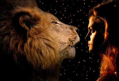
This image is comprised of two images I took last year. I titled it “United” because I used Photoshop to bring the photos together of different subjects. Both images were taken with a Nikon d3400. The lion was captured sometime in the spring and the picture of Nicolette was taken last fall in Tuscaloosa around sunset. I edited this image by combining the two as they were both very dark and surrounded by the sparks. I had previously edited both by increasing the contrast and using the dodge and burn tools to bring out some details. I think it could be better if the lion was moved a little farther left.
Subscribe to:
Post Comments (Atom)


6 comments:
Wow... this picture is honestly so cool. It brings a sense of peace to my mind whenever I look at it. I don't think any other picture I have seen has done that before. I also really like the soft orange background and how it really ties this picture together. Great job
This is probably my favorite composite ever!!! Usually when there is a composite image, quality is sacrificed, but this is one exception. I love how the warm theme is carried out throughout all of the photos. This honestly reminds me of a movie poster, minus the words. Great job!!!
This is a really good picture. I love the detail and how you edited it. Greta job!
Jasmine W - HHS
WOWWWWW!!!!!! This picture is stunning. I love everything about it. There is nothing I would change to make it better, because it's perfect.
This is so beautiful! I love the colors and the warmth of the picture! This kind of reminds me of Narnia. Overall, you did a fantastic job! Love it! -Emily R HHS
This is one of my favorite pictures on the blog. This picture is so cool. FIRST OF all, I love how you blend both picture together. The background and the lighting on the face are perfect. I don't have anything to change in this picture. You did a great job!!
Post a Comment