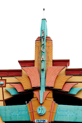
This image is titled The Regal. It was taken late January while on a trip to Nashville. It was taken with my Canon Rebel camera. The building is a movie theater that I came across when I was exploring before going to the hotel. I edited this image by bringing up the contrast because the weather was overcast, and caused the image to be dull. I brought up the brightness as well to make the building show up against the white of the sky. I think that the image could be better if the sky was not white, but I was worried another color would take away from the color of the building.
Subscribe to:
Post Comments (Atom)


6 comments:
I love this picture! It's color is amazing. If I could change anything I would stand more central and try to make the photo symmetrical. I think that would be cool.
I really like this picture! I think the exposure is a little high so the photo is really bright but that might be because of the lighting. The colors in this photo are really vibrant which I like. I think you could bring up the saturation and down the exposure and highlights a bit and it would help the color and lighting. I really like this photo!
The first thing that caught my eye was the color difference between the warm colors of the building and the bright sky. By increasing the brightness, it brought my attention to the bright blue sections of the building. Additionally, I like your composition in this photo! It brings out the details and beautiful architecture of this theatre! Great job!
-- Sydney R HHS
I love this image! The colors in it against the white background look so nice. I think you did a good job with making the colors pop more. I agree that if you were to change the color of the sky that it might take away from the building. Overall I like this image a lot and think you did a good job with it.
I really loved this pictures so much I like how you took it, it looks so clear and foucs.like what you said it would be better if the sky was not white, but above all its a really beautiful image.Good job.
This picture is really cool! I like the colors used in this picture. They are for the most part contrasting which brings your attention to the details and shapes in the image. I like that even though the colors are faded they are still colorful enough grab your attention. I also really like the lighting in this image. I think the fact that it was overcast so the light was softer. There are no distracting shadows and the neutral background keeps your focus on the building itself. Overall, I really like this image especially the colors and lighting and I think you did a great job!
Post a Comment