Friday, September 7, 2018
Charis H - Vision
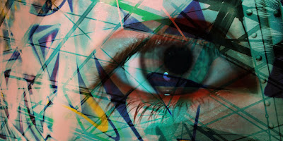
I named this picture vision. The background picture was taken over the summer in my house, and the overlaid image was taken a few weekends ago of a mural in downtown Birmingham. I did some overlaying and increased the saturation of each picture. The eye could have been sharpened a little bit more to make it more distinct.
Subscribe to:
Post Comments (Atom)


2 comments:
I really love the way that you edited this picture. The overlap of colors around the eye and skin really bring this image together. I agree that the eye could have been sharpened a little more, but overall, really good job!
Danielle M - HHS
This Picture is really cool. I like all the colors and that they all are closely related to blue. i agree that you could have sharpened the eye to make it stand out more but i also think its fine as is. I also like the little bit of an industrial look that you got on the right side of the picture. Overall you did a very good job with the editing. Keep it up!
Post a Comment