Wednesday, February 17, 2016
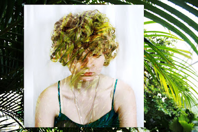
Kate M- Portrait
I took the picture of the girl for the high key assignment in the studio. The leaves that I overlayed on her and then used in the background I took at the botanical gardens a couple of months ago. I cropped the original picture of her because I didn’t like the background being pure white, but that picture was too small so I added the leaves to make it a little more interesting. I took the background picture, made it vertical, and set it to overlay on top of the girl. I really like this picture and I can’t think of much that I would change.
Subscribe to:
Post Comments (Atom)


6 comments:
This is so awesome. I love it a lot. Everything about it is wonderful.
This image is wonderful! Your photograph reminds me of something that you would see in a magazine. I love the creativity of how you edited your images. This is a very lovely photo! -Grace H-HHS
I love this image! This is a really cool composite image and I like the color scheme. Everything is positioned really nicely. Great Job!
~Zoey E. hhs
I love the colors and the combination of the two pictures. I wouldn't change anything about this. The overlay layer on her is great too!
Lupita G- HHS
I love this photo! I like how it all flows together, the composition and overall editing is really great! I personally wouldn't change anything about it!
Chloe J-HHS
I love this image! This is a really cool composite image and I like the color scheme. Everything is composed really nicely. Great Job!
Post a Comment